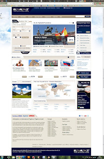
 The prototype I made is quite similar to the original web page because my partner had almost no problem using it the way it is.
Her only two problems were:
1) She tried to enter the name of a country and not of a city. In my new redesigned page you could enter both. If you choose to enter the name of a country the page will offer you all the cities in that country that could be your destination.
2) Her second problem was when she wanted to change a detail and went back to the first page all the information she put there disappeared and she had to re-enter it. It was quite annoying for her. In my redesign her data would remain there if she were to come back to the main page.
A thing I noticed was that all the relevant information was at the top of the page. My partner did not try to scroll down even once, and I doubt most people do. This led me to believe that anything beneath the top of the page that you see right away is useless and doesn't add value. That is why I decided to eliminate it.
After finishing entering her information on the first page, the process until she was asked to enter her credit card information was easy and streamlined. On the second page there was a calendar with available dates and prices that had only one minor fault. It showed a price for each date, but since she wanted two tickets it was unclear whether the price was for one person or both. After she examined the page more closely she realized it was for both. I suggest the page makes clear it is for both and also specifies a price for each person. For example on 14/3/2012 a ticket to berlin costs 401.10$ per person and a total of 802.2$ for both.
This is the original webpage:
